UX/UI Product Concept
floom
An adaptive support journey for moments of acute anxiety.
Role — UX/UI Designer·Scope — Discovery, Research, UX Strategy, Interaction Design, UI Design, Prototyping, Usability Testing·Year — 2024·Outcome — Interactive High-Fidelity Prototype
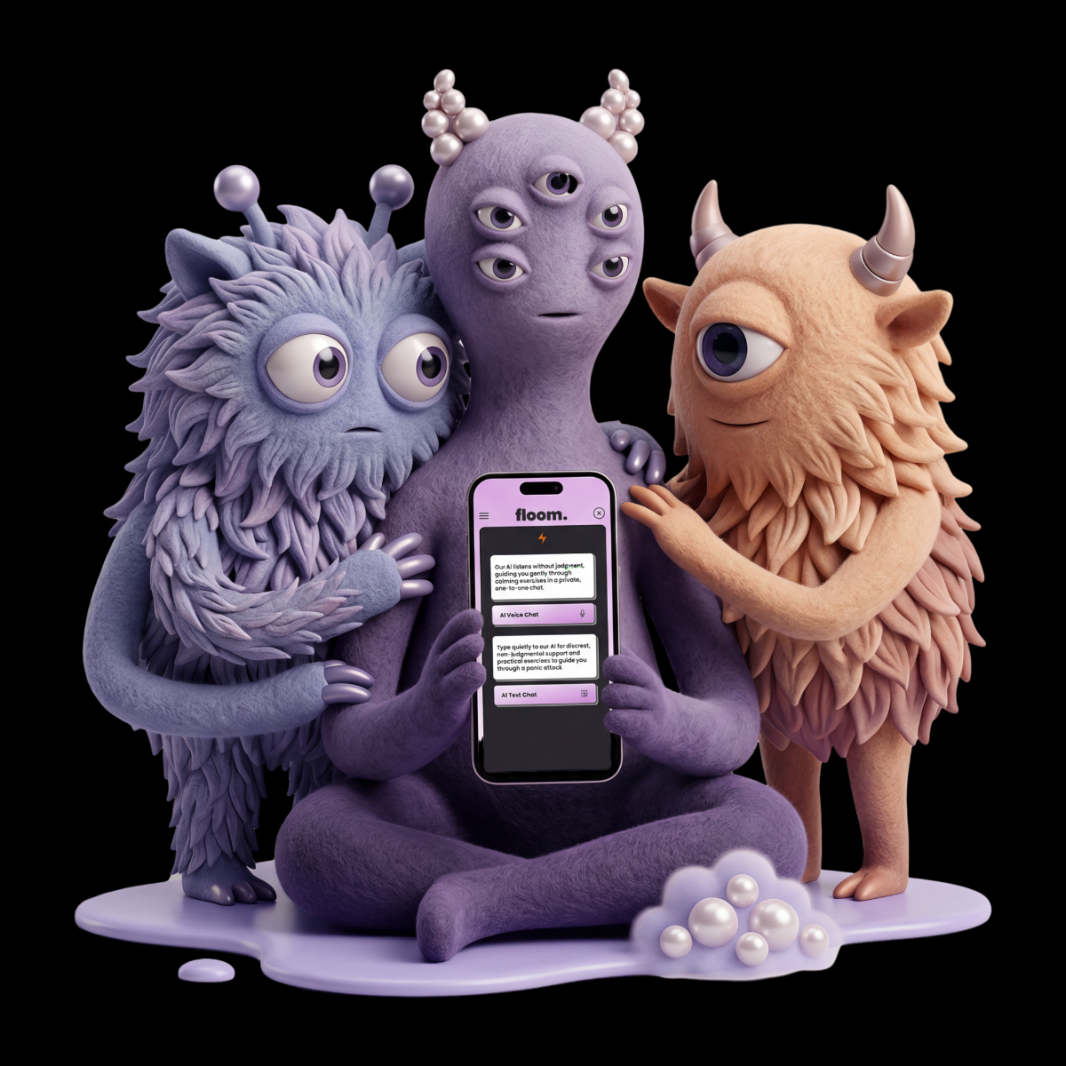
floom in 30 Seconds
Summary
floom in 30 Seconds
An adaptive support journey for moments of acute anxiety.
Challenge
How might a digital experience support someone during acute anxiety without adding friction, unnecessary choices or clinical language?
Approach
The process combined qualitative interviews, an online survey, competitor analysis, research synthesis, information architecture, user flows, wireframes and iterative prototyping.
Key Learning
In a high stress context, clarity and control matter more than feature breadth. The strongest direction was not a catalogue of wellness tools, but a sequence that responded to the user’s own assessment.
Live Prototype
Context
The Starting Point
Many of the tools reviewed during the competitor analysis focused on retreat, meditation or a single calming exercise.
floom started with a different question: how might support work within the situation itself, rather than making withdrawal the default?
The concept focused on situations that users understand to be safe but experience as overwhelming. A breathing exercise was treated as one possible step, not as a complete solution. The journey could respond to repeated check ins and offer different forms of guidance and focused attention.
floom was developed as a research led UX/UI concept and interactive prototype. It was not designed as a clinical or medically validated product.
From Research to Design Requirements
Discovery research combined qualitative interviews, an online survey and competitor analysis.
From recurring patterns, I created the synthetic persona Luke Calmer, supported by a storyboard and user journey map. These artefacts connected user needs, emotional states and situational context to concrete design decisions.
Immediate access
Passwords, hidden navigation and multiple entry steps can become barriers during acute anxiety. Support needed to be visible and quickly accessible.
Reduced cognitive load
Clear language, limited choices and direct next steps were essential. The interface needed to guide without creating additional cognitive effort.
Neutral, structured guidance
Interviews suggested that friends, family or partners are not always available or equipped to help in the moment. Repeated reliance on close relationships can also create pressure for everyone involved.
This informed an AI based conversational support layer that could structure the next step without replacing personal relationships or professional care.
Support beyond a single exercise
Research and interviews suggested that breathing alone would not fit every person or situation. The experience therefore needed repeated check ins and more than one form of support.
These findings positioned floom as an in situation support tool rather than a passive wellness app.
Design Requirements
Immediate AccessIn Situation SupportNeutral GuidanceClear Next StepsRepeated Check InsFocused AttentionUser Control
Designing the Support Journey
The design requirements were translated into a guided sequence with as few unnecessary decisions as possible.
Fast entry
The concept included optional biometric access, removing the need to remember or type a password. Inside the app, a persistent lightning icon created a direct route into Panic Mode.
Guided self assessment
The prototype simulated an AI guided conversational check in. The system asked how the user was feeling and invited them to assess the intensity of the panic response.
The conversation was not intended to diagnose. The user’s own assessment determined which activity was suggested next, avoiding the need to browse a large exercise library during an already demanding moment.
The conversational layer was designed to remain available when close contacts were unavailable, uncertain how to respond or not the right source of help in that moment.
Staged support
The first suggested activity was a guided breathing exercise. A follow up check in then asked whether further support was needed.
If the user still felt overwhelmed, the flow continued to an augmented reality forest walk concept, followed by another check in.
The final matching task shifted attention towards a concrete cognitive activity. It was not included as entertainment or gamification.
Tested Journey
- 01Quick Access
- 02Panic Mode
- 03AI Check In
- 04Self Assessment
- 05Breathing
- 06Check In
- 07Virtual Walk
- 08Check In
- 09Focused Attention
Within the prototype scenario, the journey ended when the user indicated that they felt able to remain in the situation.
Building the Prototype
Using Figma, I translated the product architecture and core flow into Lo Fi wireframes to explore navigation, hierarchy and the wider scope of the concept.
These structures became an interactive Mid Fi prototype for usability testing. The prototype connected decisions, repeated check ins and multiple states across the breathing exercise, virtual forest walk and focused attention task.
The High Fidelity pass introduced a coherent UI system built from typography, colour, buttons, icons, conversation modules, activity cards and interaction states.
The matching task included start, active, correct, incorrect, progress and completion states. This allowed the sequence to be demonstrated and tested as a functioning interaction.
The result was an interactive design hypothesis rather than a production ready medical product. It made the concept concrete enough to test, question and refine.
Usability Testing and Iteration
The interactive Mid Fi prototype was evaluated in moderated usability sessions conducted both in person and remotely.
The sessions focused on navigation, comprehension, interaction control and how appropriate the experience felt for a sensitive, high stress situation.
Access and hierarchy
Participants expected Panic Mode to be more prominent and immediately available. Some entry points required too many steps, while the hierarchy of login and navigation was not always clear.
This reinforced the need for biometric access, a persistent Panic Mode shortcut and a more direct route into the support journey.
Guidance and control
The breathing exercise needed clearer controls and stronger feedback. Suggestions included a visible counter, optional sound, a central play control and the ability to skip or change an activity.
The feedback confirmed that structured guidance still needed to preserve user control.
Tone and stimulation
Some visual elements, wording and interactions risked feeling unclear or overstimulating. The virtual forest walk needed more explanation. Character design, colour and clinical sounding language also required careful adjustment.
These findings informed refinements to hierarchy, interaction states and visual intensity.
The study assessed usability, clarity and perceived appropriateness, not therapeutic effectiveness.
Reflection
floom evolved from a broad feature idea into a focused support journey built around access, guidance, self assessment and attention.
The project also made the responsibility of designing for a sensitive context very clear. An interface may provide orientation, but it must not imply diagnosis, treatment or clinically validated effectiveness.
For me, floom was the project in which research, interaction design, UI systems and prototyping first came together as one process. It taught me to reduce a broad idea to a testable sequence and to treat uncertainty as part of the design problem rather than something to hide.
A real product would need clinical expert review, privacy by design, clear AI governance, accessibility testing and further research across different contexts. The value of the prototype lay in making the concept concrete enough to test, challenge and improve.
Explore More Work
Continue with selected projects, visual explorations and case studies.
Back to Work →